Monday, June 29, 2015

Weekly Inspiration No. 4

Well that didn't take long for me to fall off the wagon, eh?  So it's almost been a month since I updated my blog posts.  Sorry for the delay.  This one's going to be kind of short.  I didn't really delve into this artist too much so I apologize.  I chose Alex Ross weeks ago.  When I picked him I asked Kevin if he'd heard of him.  Alex Ross is a very well known artist in the comic book and graphic novel community.  Kevin immediately said yes.  One of his favorite graphic novels is Astro City: Confession.  I need to go through Kevin's collection of graphic novels one day.  He has a pretty big collection.  But getting back to Alex Ross...  In what I've read about him, he works in watercolors mostly.  Meaning he's a painter first and foremost.  He usually does covers and a lot of character design for story lines because that watercolor being the medium he works in, it takes forever.  Could you imagine doing an entire comic book with only watercolors.  It would take a wicked long time.  He is the best in the business though as far as reputation goes.  I found it interesting he went to the same art school as his mother, the American Academy of Art in Chicago.  Here are some of my favorites that I found that Alex Ross has painted/designed.
Marvels Painted 6

Astro City cover #5
Superman #676 cover

Batman Black and White p.3


Batman Painted 3

The Shadow #12


Monday, June 8, 2015

Weekly Inspiration No. 3

This week I looked at my usual go to for artists, artcyclopedia.com, and ended up on the instillation artist page.  There was a decently long list of artists to choose from dating back to an artist born in 1917.  I started by going past names that I knew like Rebecca Horn and Annette Messager.  I looked a few artists I thought I recognized and wasn't really impressed by the work that I saw.  Don't get me wrong, I'm not saying that these artists aren't good at what they do.  I just wasn't really "inspired" I guess is what I'm trying to say.  I then decided I would look at all the American artists on this list.  I kept going until I found Zoe Leonard.  She was born in New York and still works and lives in the state.  I'm not going to go into as much detail probably as the other two artists I've researched so far.  I didn't really delve into her work until today.  I'm not going to lie, I definitely put this week's blog off until last minute.  Nothing seemed to grab me, but she's the one that kept me interested enough to look at more of her work so here we are.
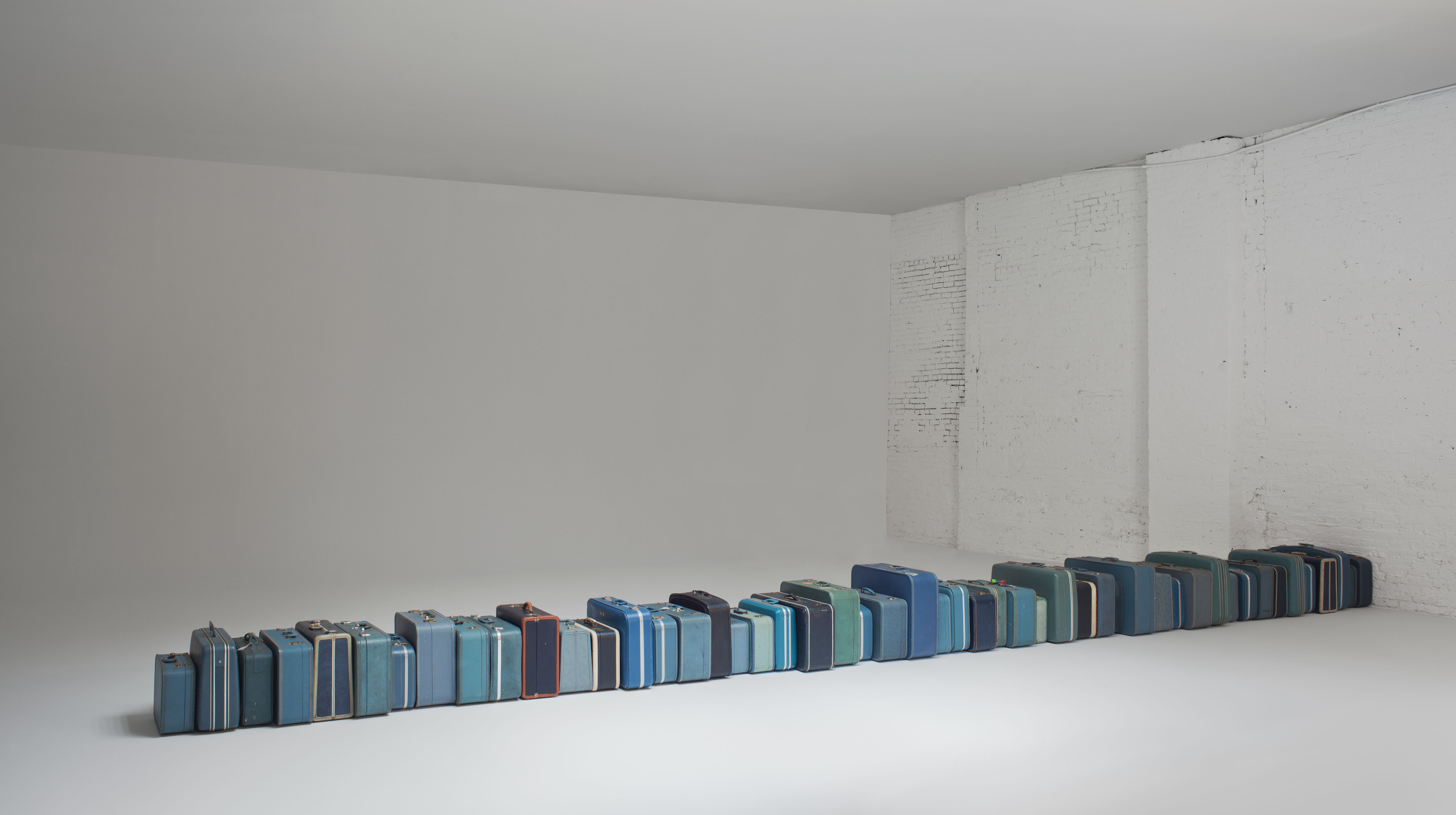
"1961", 2002-ongoing
This was the installation that initially caught my attention and made me want to see more of her work.  This piece, Leonard adds a vintage suit case for every year she's alive.  It's interesting to me that she used suit cases to represent a year of her life.  I wonder what the significance is.  Did she travel a lot in her childhood?  Were her parents in the military and that's why she traveled so much.  Does she just like vintage suit cases?  Why mostly blue vintage cases?

I then found an interview with Leonard.  Here she explained her process.  As an artist, as you will see in the next pictures I post, who works with photography a lot she wants her viewers to see things how she sees them.  They'll obviously make their own interpretation of her work, but that's part of the process.  The next installation I saw is called "Strange Fruit (For David)."  This also caught my attention because in the text surrounding this piece Billie Holiday came up.  She had a song with the same name.  This piece was done around a time when Leonard was big in the AIDS awareness movement.  She sewed zippers and used yarn and string and buttons to dried fruit skins.  From what I gathered it was for a friend who died of AIDS.
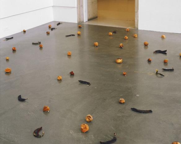
"Strange Fruit (for David)," 1992-1997

"Strange Fruit (for David)" detail, 1992-1997
There is another installation she did that interested me as well.   This installation is of dolls that Leonard found at yard sales and thrift stores over a period of time.  It seems from the things I've read that she found it interesting that all of them were just discarded.  And that she thought of the dolls' story: where they came from, who played with them, and why they were given away or discarded.  
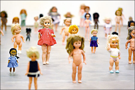
"Mouth Open, Teeth Showing," 2000.

Another thing she talked about in the interview I read was that she took pictures at this medical museum in Paris.  There was a bearded lady in a Ball jar.  It doesn't seem to be a Ball jar in the photograph she took, but that's what she said a few times in the interview.  Leonard said that this "specimen" was just in a back room on top of a filing cabinet or something.  Just an afterthought it seemed.  It fascinated her that this poor woman's head was just discarded like that.  And so many questions: were her family compensated, was her body buried, where did she come from?  I guess she worked for a circus, but still, it's so creepy that they preserved her head for science? 
"Preserved Head of a Bearded Woman, Musee Orfilia," 1991.
One of the photo installations I really enjoy in its entirety is "Analogue."  This is a compilation of 412 photographs she took with a Rolleiflex camera.  She took pictures from 1998-2009 of neighborhoods in New York City.  There are a lot of store fronts and street cart vendors.  It's neat to see the changes in the storefronts over the years.  

"Analogue," 1998-2009.
This is what the installation looks like in a museum.

"Analogue," 1998-2009.
I hope you enjoyed looking at some of the work by Zoe Leonard.  I'll leave you with one of her more recent installations.  I definitely relate to this artist.  Through my artwork, especially my photography, I want the viewer to see things the way I do.  They might not view it in the same way that I do, but that's the interesting part about hearing what people think of your artwork.  They see things, sometimes, in a completely different way than I do.  Leonard's view of the world changes in medium as well which I relate to as well.  She might feel that a physical found object is the way to show how she's feeling about a subject, or maybe it's a photograph, or a group of photographs.  And the subject matter is all over the place too.  Which is interesting to me.  She has different feelings at different points in her life and she's sharing that with the world.  We get to see into her diary so to speak.  She's putting herself out there for the world to see.  That's brave, to me.  To put all your thoughts and emotions out in the open, very courageous.


Monday, June 1, 2015

Weekly inspiration No. 2

I'm a bit late this week, but I'll get into a better routine eventually.  This past week I looked into the artist Chris Gilmour.  I was going to do Wassily Kandinsky, but I thought that might get a bit boring.  I was going to piggy back artists that were friends or inspirations of the artist I did the previous week.  But I decided to go a different route.  At first I thought I'd share my favorite artists, but that wasn't really the goal of this project.  It was to learn about new artists and the need to be inspired artistically again.
Strongbox, 2006
I'll start with probably my favorite that I've seen of his work.  As you can see, his medium is cardboard.  He uses cardboard and glue.  This is one of his later works and you can kind of tell if you look at the right side and on the pieces on the open door that you can still see the print on the original cardboard.  There's an interview on his website where he said that he started out by using cardboard in it's purist form.  Meaning he would use pieces that didn't have tape, print, or labels on it.  But in his later work he enjoys seeing the cardboard for what it is.  People discard it everyday and he wanted to use it in a way that everyone knows it, even it's more unappealing sides.  I enjoy that he changed his perspective in that way.

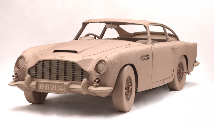
Aston Martin, 2006
This is another piece I enjoy.  It's life size and he did all the interior and the inner workings of the engine as well.  I read that a lot of people who viewed this work wanted to get inside and try everything on the car.  It's incredibly detailed.  He also did a Fiat car too that was life size, and detailed as well.  I think it's so cool he wanted to recreate these cars to the "t."  Seems like he did a lot of research and sketches to make these come to life.  That is something I don't tend to do.  If I'm making something, painting, or drawing something I tend to just go and enjoy the mistakes and layers that end up happening.

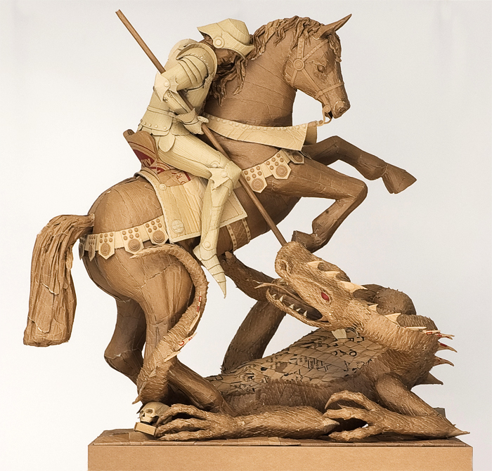
The Triumph of Good and Evil, 2010
It's crazy to me that he does everything out of cardboard and glue.  Everything is so detailed.  He has done a few statues like this.  I mean he's done a few busts a few human formed statues as well.  This one is my favorite of his human figures.  It's so fantastical and it looks huge!  I'd love to see his work in person.  Just to see all the detail of his work.  The dragon is so cool looking.

Chris Gilmour grew up in the UK and now lives and works in Italy.  He has a wikipedia page if you'd like to read more on him there.  His biography on his website and the wikipedia page are pretty similar.  I didn't find too much on him, but I was really glad to learn about him.  When I was thinking of an artists to do this past week, I wanted to find the grad student that was student teaching with one of my professors in art school.  I think it was my second year of art school.  He like to work with cardboard as well.  He showed us his portfolio one day in class and told us about why he liked to work with cardboard.  I couldn't remember his name and he wasn't listed in a Google search, that I could tell anyway.  From my memory he liked to do sculptures of everyday scenes, like a kitchen or something along those lines.  I was bummed I didn't find him, so I settled on Gilmour instead.  

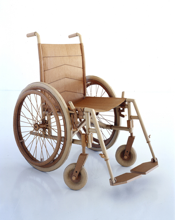
I'll leave you with this last piece and what he said about it.  He said in that interview I read that he felt that his most important piece was the wheelchair.  It created the most reaction, emotion, an/or feeling from his viewers.  Most people didn't go near it or want to touch it.  It made a lot of people uncomfortable it seemed.  I thought it was interesting that he chose to do a few wheelchairs.  But now it makes sense.  It's intriguing for artists to hear the reactions of their viewers.  Most of the time it's nothing like what you would expect them to think of the piece.  I find it incredibly fun to hear what viewers think of my artwork, so it's cool to hear that an accomplished artist feels similar to me on that point.  

Wheelchair, 2003